Written By: David Carpenter
All too often mobile forms make use of dropdown menus for input when simpler or more appropriate controls would work better. Here's several alternatives to dropdowns to consider in your designs and why.
Expectations impact conversion
No one likes filling in forms. And the longer or more complicated a form seems, the less likely we are to jump in and start filling in the blanks -especially on small screens with imprecise inputs (like our fingers).

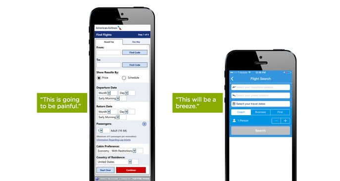
While there's two extra fields in the "painful" version above, the primary difference between these two flight booking forms is how they ask questions. One makes use of dropdown menus for nearly every question asked, the other uses the most appropriate input control for each question.

Interacting with dropdown menus on mobile and the desktop is a multi-step process often requiring more effort than necessary. First tap the control, then scroll (usually more than once), find & select your target, and finally move on. We can do better.
Read the rest of this highly informative and educational article on LukeW's blog.
Written By: David Carpenter
Topics: Mobile Websites, Mobile Optimization
Connect On Social
Connection Model
What is a Digital Marketing Agency
What is Inbound Marketing?
What is Search Marketing Equity® ?
What is Organic SEO?
HubSpot Certified Partner Agency
How Fast PageSpeed improves SEO
Social Media Marketing
Brand Photography
Preventing Digital Marketing Fraud
How to get the most from our PPC Agency
Competitor Analysis & Market Assessment
Boosting Search Visibility with Content Optimization
Proper use of AI in Content Marketing
Connection Model has 10 reviews with an average rating of 5.0 stars on a 5.0 scale.
Third-Party Source: UpCity
From The Blog