How and Why Brands are Changing Their Logos
Today it seems like you can't go anywhere without seeing a logo featuring a sans-serif font. Sans-serifs have taken the branding world by storm, yet hardly anyone realizes it, with companies across various industries jumping on the bandwagon. But why has this trend become so popular, and what does it mean for the future of logo design? Previously, we introduced the trend toward brand simplification. In this blog post, we'll explore the origin of the sans-serif trend, its appeal, and impact on brand identity, notable examples of brands embracing sans-serif fonts, the challenges and criticisms this trend faces, and the potential future of logo design beyond this phenomenon.
Understanding the Sans Serif Invasion

The Sans Serif Invasion refers to the widespread trend of brands transitioning their logos to simpler designs. This shift has been driven by a desire to appeal to a broader demographic and enhance readability. The movement began in the fashion industry and has since spread to the tech sector, with numerous brands updating their old logo images to stay current and relevant in the market.
The origin of the sans serif trend can be traced back to around 2017-2018 when fashion brands started adopting this typeface for their logos. Seeking a more timeless and versatile look, these brands led the way in this trend, with other industries following suit.
Origin of the trend
Fashion brands were among the first to adopt sans serif fonts in their logos, aiming for a more contemporary and adaptable aesthetic. This shift was driven by a desire to create a modern and minimalist appearance that would appeal to a wider audience and emulate their contemporaries. The art nouveau movement also significantly impacted design, with this trend representing a shift towards minimalism and simplicity in logo design.
Since the introduction of Accidenz-Grotes in 1896, the use of sans serif fonts has become more widespread, particularly with recent redesigns of logos by prominent companies. The international typographic style has also influenced the adoption of sans-serifs in logo design, contributing to the growing popularity of this trend.
Impact on brand identity
The shift to sans-serif fonts has considerably impacted brand identity, with many logos becoming more similar and less distinctive. The prevalence of sans-serifs in logo design has made logos more uniform and less unique, as many brands now opt for the same font and style. This homogenization of logos has led to challenges and criticisms of the sans-serif trend, such as a loss of uniqueness and the potential for overreliance on trends.
Branding and fashion are closely interconnected, as branding provides recognition and shapes public opinion of the products available. Fashion logos are essential to the industry as they identify a brand and create a public perception of the products available. As this typographical movement grows, the impact on brand identity becomes an increasingly important consideration for businesses.
The Appeal of Sans Serif Fonts

Sans serif fonts have become famous for their simplicity, versatility, and improved legibility, making them appealing to brands across various industries. The font's modernity, clarity, and legibility make them an attractive choice for brands and designers. They are also known for conveying a sense of innovation and sophistication. Additionally, their legibility from a distance makes them suitable for posters and slides.
The distinction between serif fonts and sans-serifs lies in their design elements. Serif fonts feature decorative elements on the edges, while a bold and solid appearance characterizes sans serifs, hence the addition of "sans," which means without in French. This clean and simple design has contributed to the widespread adoption of these fonts in logo design and branding, as they offer a sense of simplicity, minimalism, and sophistication.
Simplicity and versatility
The simplicity of sans serifs can be attributed to their clean and straightforward design. The lack of decorative strokes, known as sans serifs here, lends them a modern and contemporary aesthetic. This simplicity allows these fonts to communicate information efficiently, making them suitable for:
- Digital design
- Websites
- User interfaces
- Presentations
- Headings and titles
Sans serifs are highly versatile due to their ability to be used across various platforms and media. They are legible in digital and print formats and can be scaled to different sizes without compromising their readability. Moreover, their design style can be adapted to various aesthetics, from modern and minimalistic to classic and traditional.
Improved legibility
One of the key benefits of sans-serif fonts is their improved legibility, which appears particularly on digital displays. Fonts such as:
- Arial
- Helvetica
- Verdana
- Adsans
They are generally considered more legible than serif fonts, especially for individuals with compromised vision. This increased legibility has made sans serifs a popular first typeface choice among modern brands, as they are easily readable on digital devices and convey a sense of innovation and sophistication.
Observing magazines, one can note that picture captions and credits are often set in sans-serifs. This increased legibility makes this typeface an attractive option for brands looking to improve the readability of their logos and other marketing materials, both online and in print.
Timelessness
The timelessness of sans-serif fonts is attributed to their neutral and consistent design, combining aesthetics and functionality. They possess a timeless appeal, allowing them to be utilized in various design contexts without appearing outdated. This timeless quality makes these fonts ideal for designer brands looking to maintain a consistent and recognizable identity over time.
Several fashion brands like Gucci, Nike, and Adidas have integrated geometric sans-serif fonts in their logos. Tech companies like Apple, Google, and Microsoft have also employed sans-serifs for their logos. The continued popularity of these fonts in logo design speaks to their enduring appeal and versatility, making them a valuable asset for brands seeking to create a lasting and memorable visual identity.
Notable Examples of Brands Embracing Sans Serif

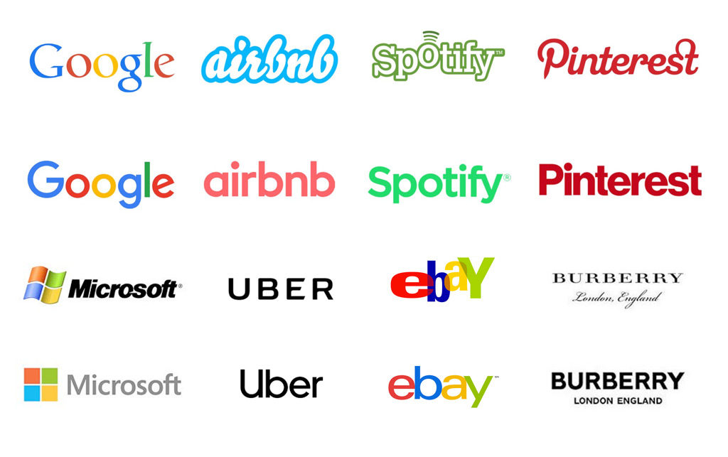
Fashion brands like Burberry and Rimowa and tech companies like Google and Apple have embraced the simple sans serif font trend in their logo designs. These brands have recognized the appeal of sans-serif fonts for their austerity, versatility, and improved legibility, making them an attractive choice for modern logo design.
The adoption of sans-serifs by these prominent brands highlights the growing influence of this trend on the branding landscape. As more and more brands choose to incorporate sans-serifs into their logos, the sans-serif invasion continues to shape how we perceive and interact with brands daily.
Fashion brands
Fashion brands have been at the forefront of the sans-serif invasion, with many choosing to update their logos with cleaner, more adaptable designs. These brands have recognized the classic and flexible appeal of sans-serifs and have incorporated them into their logos to create a more contemporary aesthetic.
Examples of fashion brands, including some luxury brands, that have embraced the sans-serif trend include:
- Balenciaga
- Burberry
- Berluti
- YSL (Yves Saint Laurent)
While maintaining a strong sense of brand identity, by adopting sans-serifs for their logos, these brands have successfully created a contemporary and minimalist look that appeals to a broad audience.
Tech companies
Following the lead of fashion brands, tech companies have also embraced the sans-serif trend in their logo designs. The improved legibility of sans-serifs on digital devices has made them an attractive choice for tech brands seeking to create a more modern aesthetic. Examples of tech companies that have adopted sans-serif fonts include:
- Yahoo
- Lenovo
- eBay
- Netflix
- Airbnb
- Spotify
- Uber
- Remax
- Nobel Prize
- LWTech
- Adobe
By incorporating classic sans serif fonts into their tech and fashion logos, these companies have created a cohesive and contemporary brand identity that resonates with consumers in the digital age.
Challenges and Criticisms of the Sans Serif Trend

Despite the popularity of the sans-serif trend, it has faced criticism for leading to a loss of uniqueness among brands and an overreliance on trends. As more and more brands adopt similar minimalist designs, logos become less distinctive and harder to differentiate from one another. Additionally, relying too heavily on trends can lead to a lack of originality and a weaker brand identity.
To address these challenges, brands must balance embracing simplicity and incorporating distinct elements that set them apart. By striking this balance, brands can create a successful, visually appealing, memorable logo while maintaining a clean and simple aesthetic.
Loss of uniqueness
The frequent utilization of simplistic styles and generic sans serif typefaces in logo design contributes to the loss of individuality. This trend causes brands to become more indistinguishable as they appear more alike. As logos become more uniform, brands must find ways to differentiate themselves from the competition while embracing sans-serifs' lack of intricacy.
One potential solution to this challenge is incorporating unique elements and custom serif typefaces into logo designs. By adding these distinctive features, brands can maintain their individuality while using sans-serifs, striking a balance between clarity and memorability.
Overreliance on trends
Brands may be tempted to follow the latest design trends without considering the long-term impact on their brand identity, resulting in logos that may appear outdated or disconnected in the future and contribute to a lack of creativity and a weakened brand image.
To counteract this criticism, brands should balance trends with maintaining a solid brand identity. Brands can create logos that stand the test of time while staying current with evolving trends by using special or unusual elements and custom typefaces while considering the long-term implications of design choices.
Finding Balance: How Brands Can Stand Out While Embracing Simplicity

Brands can attract attention while embracing simplicity by incorporating unique elements and balancing form and function in their logo designs. By adding distinctive features or custom typefaces, brands can maintain their individuality while using sans-serifs, creating a memorable logo that stands out from the competition.
Striking a balance between simplicity and memorability is critical to creating a successful logo that remains recognizable and relevant in the ever-changing design world. By considering aesthetics and functionality, brands can ensure their logos are visually appealing yet easily identifiable, helping them stand out in a crowded marketplace.
Examples of brands that have successfully incorporated unique elements into their sans serif logos include Nike, with its iconic swoosh, and Apple, with its simple yet recognizable apple symbol. These brands have managed to strike that balance creating visually appealing and instantly recognizable logos.
Creating visually appealing logos while still being easily recognizable and functional across various platforms and contexts may consider using a minimalist sans serif font for its logo but incorporate a distinctive color scheme or graphic element to set it apart from the competition.
The Future of Logo Design: Beyond the Sans Serif Invasion

The future of logo design may see evolving trends and a greater emphasis on the overall brand experience beyond just using sans-serifs. As design trends change, brands must adapt their logos to stay relevant and appealing to consumers. This may involve exploring a wider array of typographic options and focusing on creating a cohesive brand experience across all touchpoints, including products, services, and marketing efforts.
In addition to evolving trends, the future of logo design may also see a greater focus on the overall brand experience. This means going beyond logo design alone and considering the entire customer journey, from initial interactions with the brand to product use and customer support.
Additionally, it assists in producing a consistent customer experience which helps form a cohesive brand identity that customers can identify and trust, including the following:
- Increased customer loyalty
- Higher customer satisfaction
- Improved brand recognition
- Enhanced brand reputation
Evolving trends
As trends change, brands must adapt their new logo designs to remain relevant and appealing to consumers. Emerging trends in logo design beyond the Sans Serif Invasion include:
- Scribbles & sketches
- Muted colors & gradients, including dark blue shades
- Dark, experimental, and edgy designs
- Stripped-back minimalist designs
- Innovative and unique designs
These trends offer a glimpse into the potential future of logo design, with brands exploring new ways to create memorable and distinctive visual identities. By staying current with evolving trends and continually adapting logos, brands can remain fresh and relevant in the ever-changing design world.
Summary
In conclusion, the Sans Serif Invasion has undoubtedly impacted the world of logo design and branding significantly. While the trend has brought simplicity, versatility, and improved legibility to the forefront, it also raises concerns about losing uniqueness and overreliance on trends. As the future of logo design evolves, brands must balance embracing simplicity and maintaining their individuality, ensuring their logos stand the test of time and resonate with consumers in an ever-changing landscape.
At Connection Model, we understand the nuances of branding in today's digital age. Our team of experts is adept at crafting brand identities that resonate, ensuring your brand stands out in the ever-changing logo redesigns of the modern world. Contact us today to learn more about how we can help elevate your brand.
Frequently Asked Questions
Why are so many companies changing their logo?
Companies are rebranding to stay relevant to demographic and design trends and accommodate brand positioning and audience changes.
This ensures that the brand remains attractive and recognizable to its target audience. They may also need to update their messaging and visuals to reflect their current values and mission.
Why are luxury brands changing their logo?
Luxury brands are changing their logo to create a universally recognized visual language and stand out from mass market branding. The benefits of a signature pattern, shape, or hue are powerful.
These logos are designed to be fun, instantly recognizable, and evoke an emotional response from customers. They are also designed to be timeless, so they remain relevant for years to come, creating a fun and unique visual.
Why do all logos look the same now?
Minimalism has become a popular trend in logo design, with brands opting for more straightforward and legible typeface-only logos that look clean and easily identified across all devices.
These logos are often designed to be timeless and remain relevant for years. They also need to be versatile so that they can be used in a variety of contexts and still be recognizable.
Written By: David Carpenter


